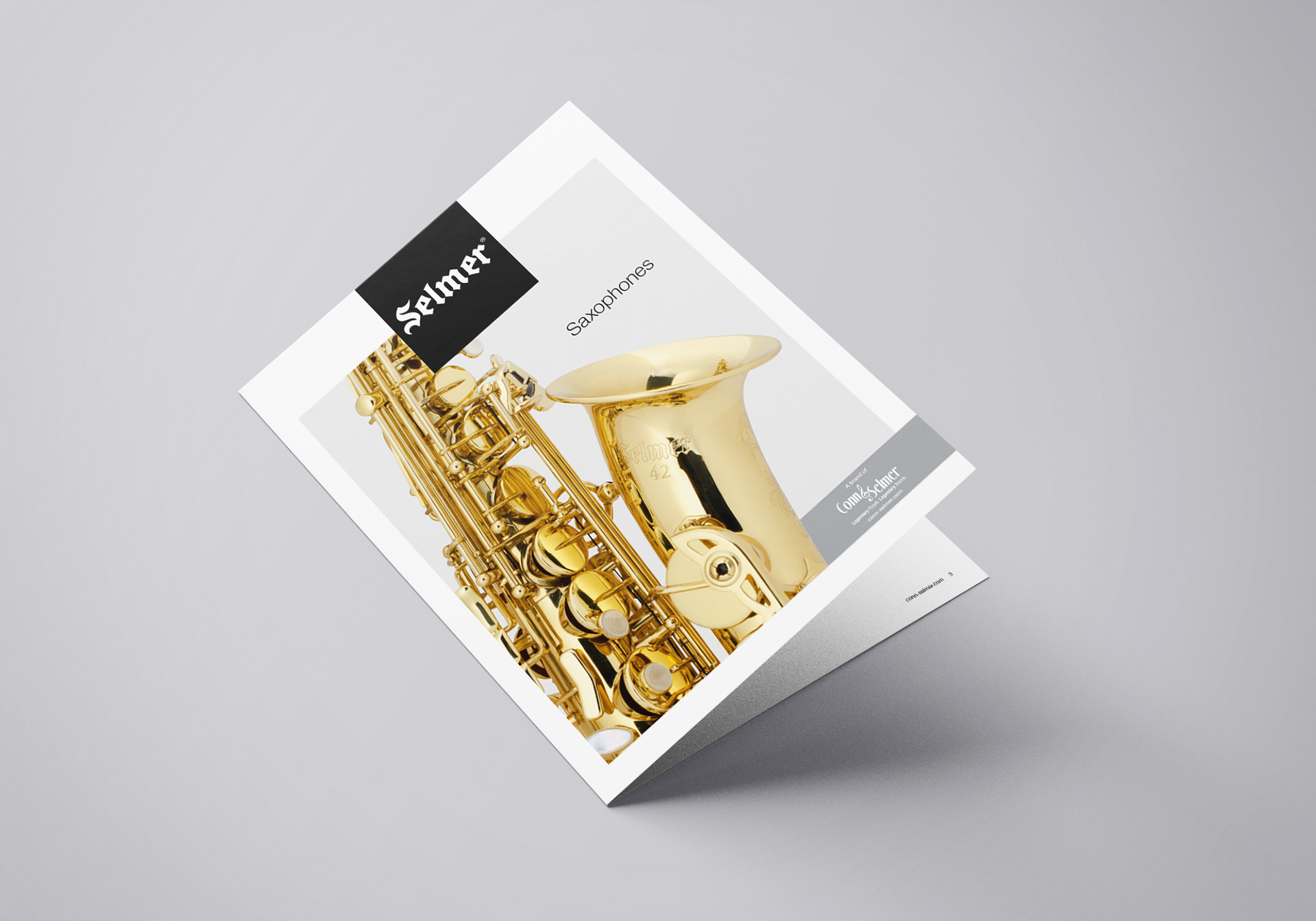
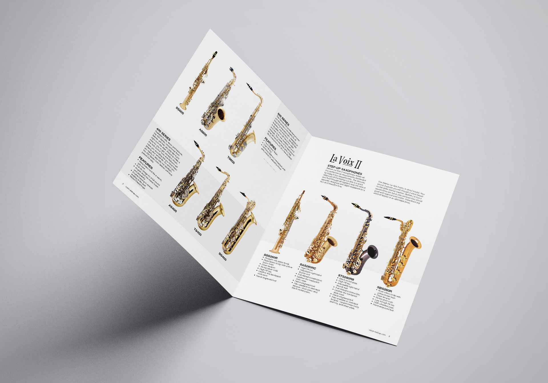
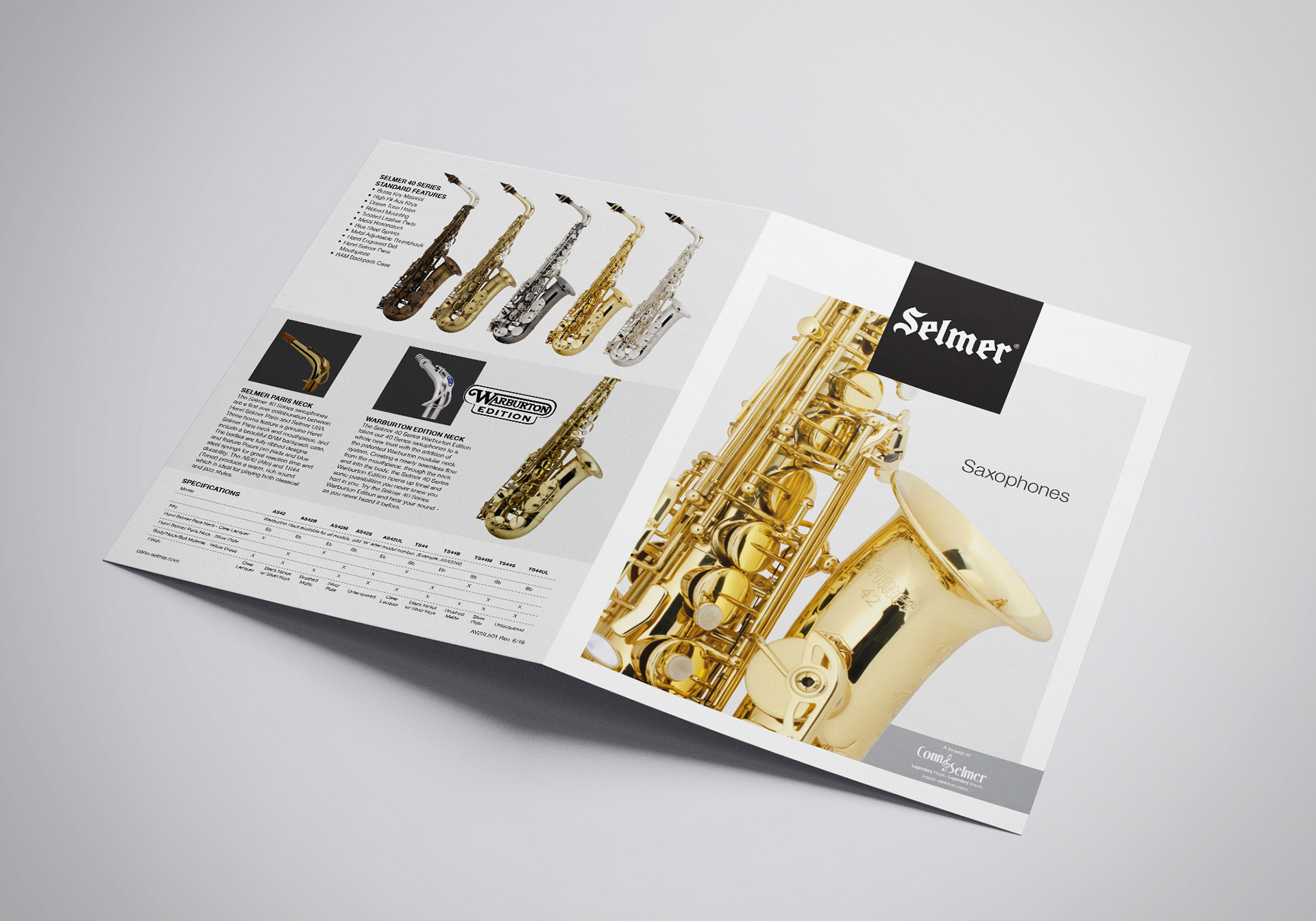
The Selmer USA brochure was a complete redesign aimed at aligning the piece with Conn-Selmer’s updated corporate identity. The goal was to modernize the brochure’s look and feel by incorporating the company’s refreshed brand standards, including updated color palettes, typography, and visual style. The result was a clean, contemporary design that better reflected the Selmer USA brand while maintaining consistency with Conn-Selmer’s broader visual identity. This project demonstrates my ability to translate brand guidelines into effective, polished marketing collateral that communicates professionalism and brand cohesion.